


In this tutorial, you’ll discover how to create a dynamic ‘flashlight’ hover effect in Bricks Builder using a combination of CSS and JavaScript. As users move their cursor across the section, the background image is smoothly revealed, adding a visually engaging interactive experience.
Special thanks to Bricksforge for the inspiration behind this concept.
While I originally built this effect for Elementor, Bricks allows for a more elegant solution thanks to its native support for pseudo-classes. This means we can embed the background image directly within Bricks—no need for additional CSS hacks.
Steps To Reveal Background Images On Hover Effect
Step 1: Set Up The Section In Bricks
- Add a new section you want your effect (this can also be in containers and blocks to create the effect in cards)
- Add the class “.cursor-flashlight” to the section/container/block
- Set your background color starting at .85 opacity (the more opacity you give, the brighter your image will be revealed)
- Set your background overlay – This needs to be solid and the same color as the background color
Step 2: Add the CSS
It’s best to add CSS for effects like this to a code management plugin. My recommendations are WP Codebox for a pro-level code plugin and FluentSnippets for a free code plugin.
Add the CSS below:
:root {
–cursor-flashlight-speed: .2s; /* Adjust the cursor effect speed here */
–cursor-flashlight-timing: linear;
}
/* ! Do Not Edit Below! */
:root {
–mouse-x: unset;
–mouse-y: unset;
transition: –mouse-x var(–cursor-flashlight-speed) var(–cursor-flashlight-timing),
–mouse-y var(–cursor-flashlight-speed) var(–cursor-flashlight-timing);
}
@property –mouse-x {
syntax: ” | “;
inherits: true;
initial-value: 0px;
}
@property –mouse-y {
syntax: ” | “;
inherits: true;
initial-value: 0px;
}
.cursor-flashlight {
position: relative;
overflow: hidden;
}
.cursor-flashlight:before {
mask: radial-gradient( circle at var(–mouse-x) var(–mouse-y), transparent 20px, currentColor 350px );
-webkit-mask: radial-gradient( circle at var(–mouse-x) var(–mouse-y), transparent 20px, currentColor 350px );
}
.cursor-flashlight:after {
content:””;
position:absolute;
width:100%;
height:100%;
top:0;
left:0;
bottom:0;
right:0;
z-index:-1;
background-position: center;
background-size: cover;
background-repeat: no-repeat;
}
Step 3: Add the JS Snippet
document.addEventListener(‘DOMContentLoaded’, function () {
let cursor;
if (document.querySelectorAll(‘.cursor-flashlight’)) {
cursor = document.querySelector(‘.cursor-flashlight’);
}
cursor.addEventListener(‘mousemove’, (event) => {
const rect = cursor.getBoundingClientRect();
const mouseX = ((event.clientX – rect.left) / rect.width) * 100 + ‘%’;
const mouseY = ((event.clientY – rect.top) / rect.height) * 100 + ‘%’;
document.documentElement.style.setProperty(‘–mouse-x’, mouseX);
document.documentElement.style.setProperty(‘–mouse-y’, mouseY);
});
});
Step 4: Add Background Image Using the :after Pseudo Element
If you’re using a jpg for your background image the normal way into Bricks, it can make the effect choppy and doesn’t look good. As a workaround, I found adding the image with the :after pseudo-element it comes out smooth.
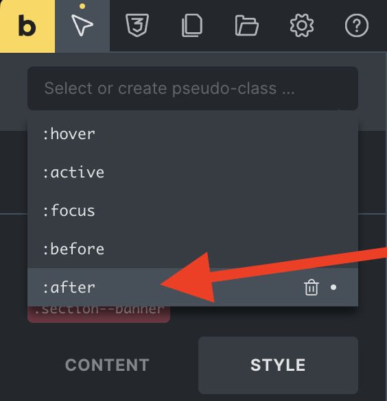
- In your section, navigate to your pseudo elements and select after (if it isn’t showing type in after and save)
- With the :after activated, navigate to your Style > Background and add your background image
- Deselect your :after and adjust the background color’s opacity to get your desired effect
That’s it! It’s super dope. Make sure to watch the video tutorial to understand better how to use this.

